North West Leicestershire District Council
Explore North West
Leicestershire
Branding
〰️
Illustration
〰️
Copy
〰️
Branding 〰️ Illustration 〰️ Copy 〰️
The Brief.
Commissioned by Swordfish Marketing, this project focused on developing the branding for a new tourism task-force for North West Leicestershire District Council. The goal was to strengthen the district’s visitor economy and encourage more people to visit, live, and invest in the area. The brief required the development of two distinct concept style guides before the creation of a final comprehensive brand toolkit – including a logo, colour palette, and visual identity – to shape the new tourism website.
Two Concepts.
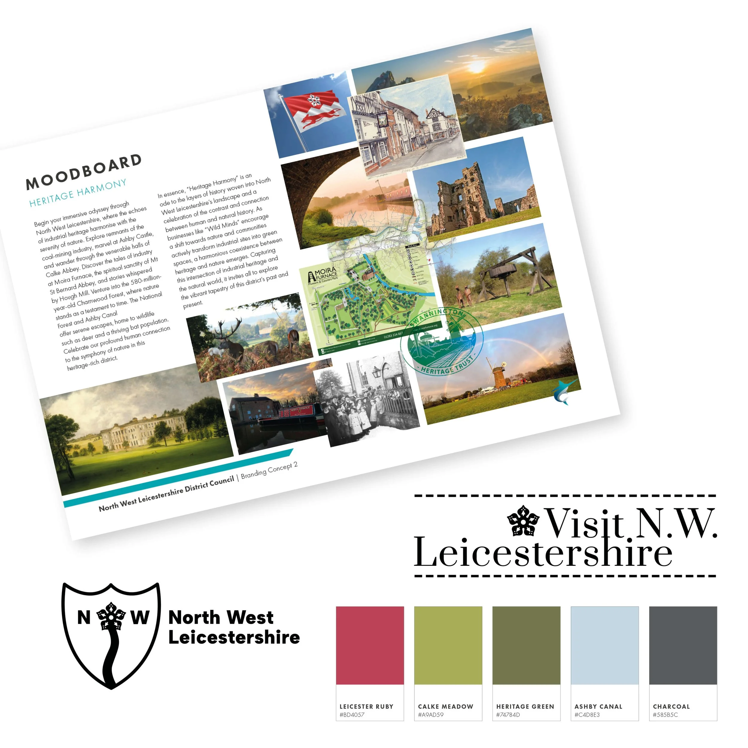
Two distinct design concepts were created to give the council a choice of direction, centred on the chosen domain “Visit North West Leicestershire.”
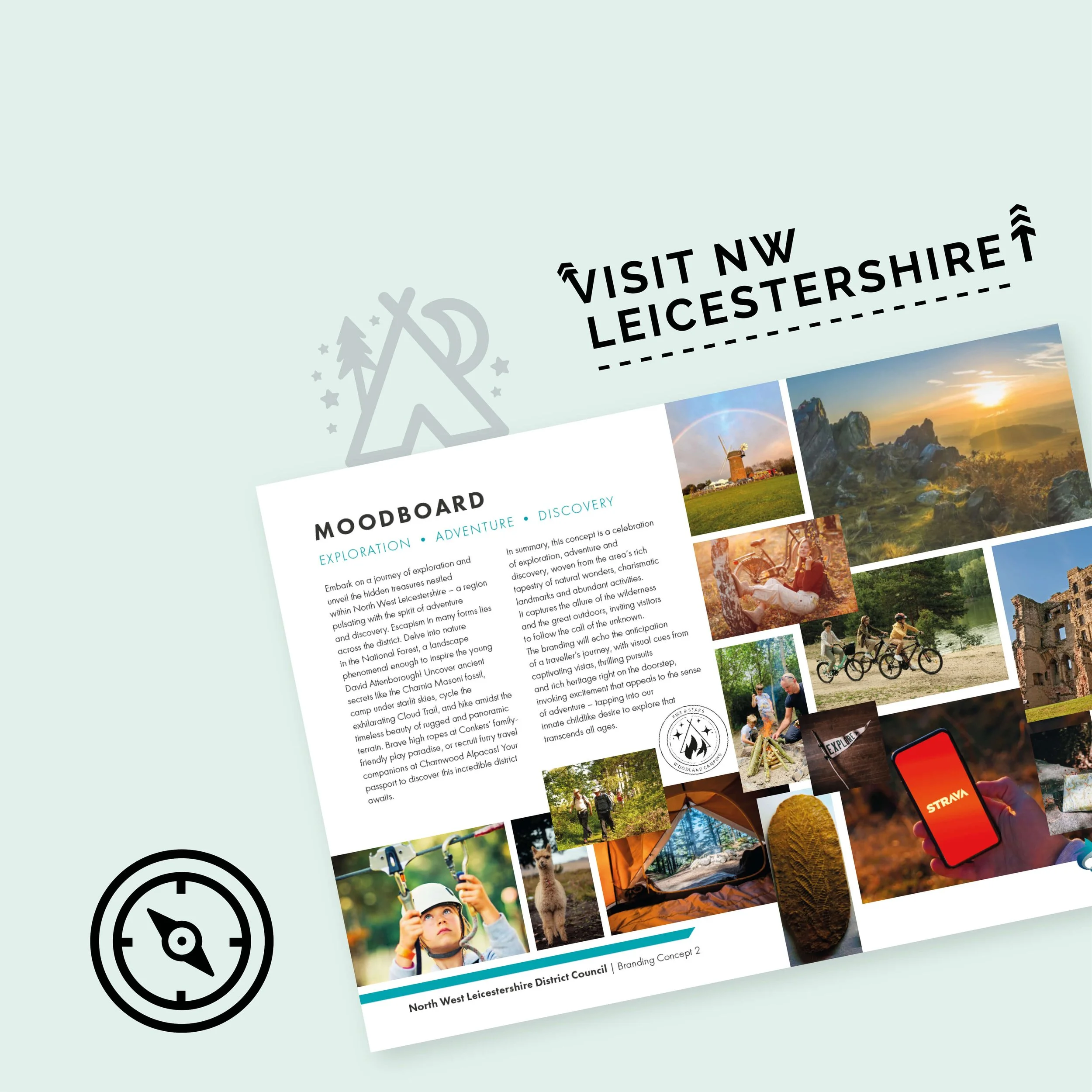
Both the naming and creative direction were conceived in-house. Heritage Harmony celebrated the district’s rich history and cultural legacy, while Exploration/Adventure/Discovery focused on wilderness exploration in the activity-rich, natural landscape.
Each concept was supported by bespoke moodboards, original creative copy, early logo exploration, curated colour palettes, and examples of potential digital application.
The Brand.
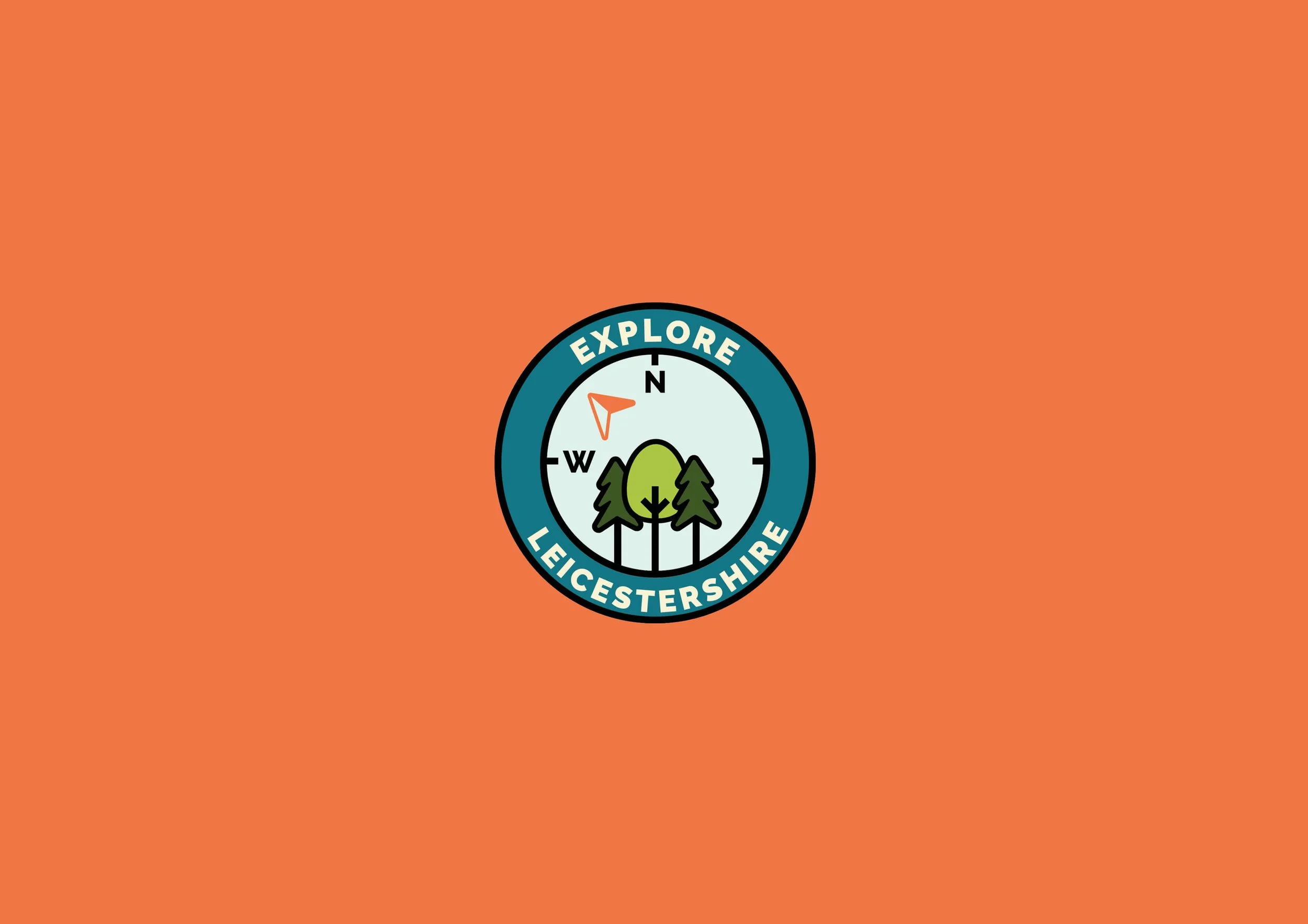
Following positive feedback for both options, the Exploration/Adventure/Discovery concept was the preferred route – that in turn inspired a strategic shift from “Visit North West Leicestershire” to the use of "Explore". The verb “explore” creates an enticing invitation, which sets it apart from other regional competitors and echoes the essence of the brand identity.
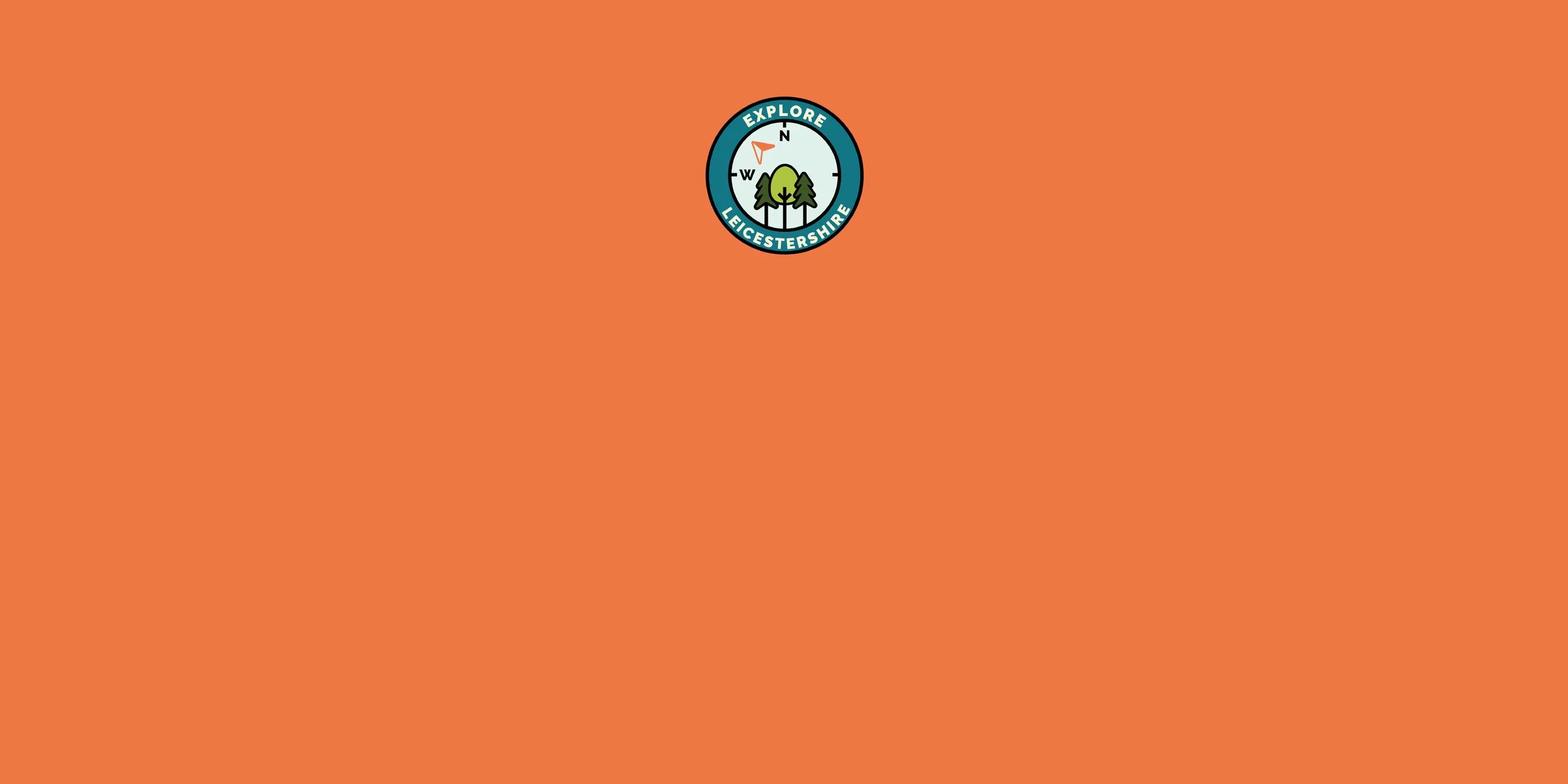
Two logo concepts were refined under this new direction, both of which were adopted for different applications. The primary logo features a badge-style mark, referencing Scout and Explorer badges, designed to also resemble a compass pointing North West. Framed within is a stylised natural landscape, reinforcing the district’s outdoor appeal and spirit of adventure.
The Identity.
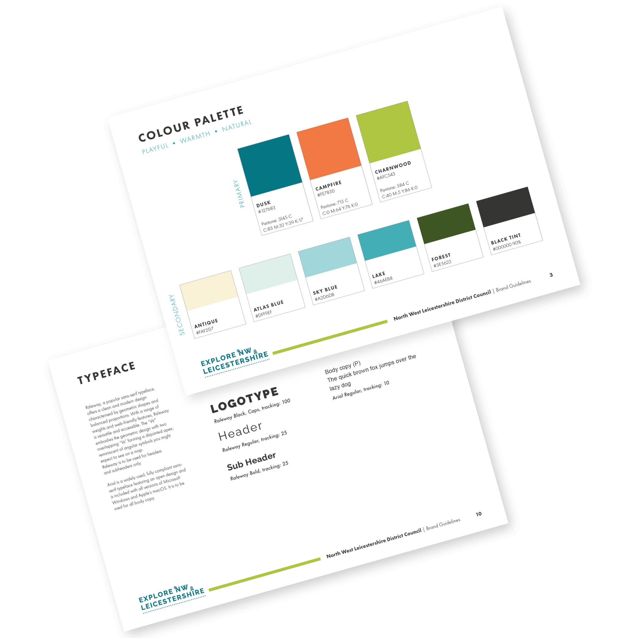
The final brand identity was expanded into a full set of brand guidelines to ensure consistency across digital and print. A custom colour palette was created to reflect the themes of nature, warmth, and playfulness—anchored by primary tones Dusk, Campfire, and Charnwood, supported by a range of soft and bold accent colours to suit varied applications.
Typography plays a key role in the identity, with Raleway selected as the headline typeface. Its clean, geometric design offers clarity and modernity, while subtle features—such as the disjointed apex of the “W”—nod to directional map symbols, reinforcing the brand’s sense of place and exploration.
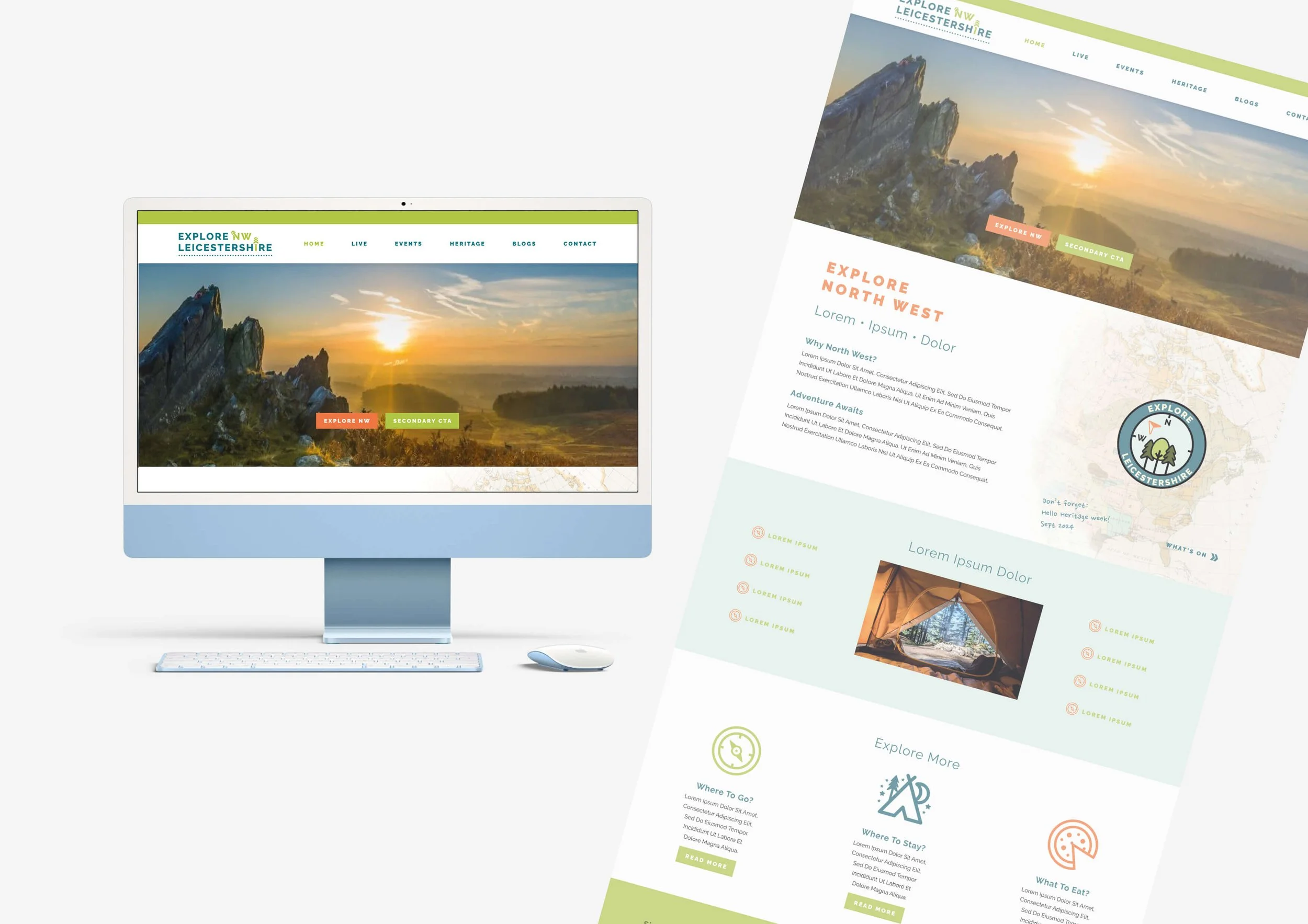
The identity was tested in context through a homepage mock-up, demonstrating how the visual language could be applied to the Council’s new tourism site. The design balances clarity with character, injecting personality through colour and custom iconography, helping to communicate both the functional and emotional appeal of the district.