
Independent Travel Agency
Branding & Website
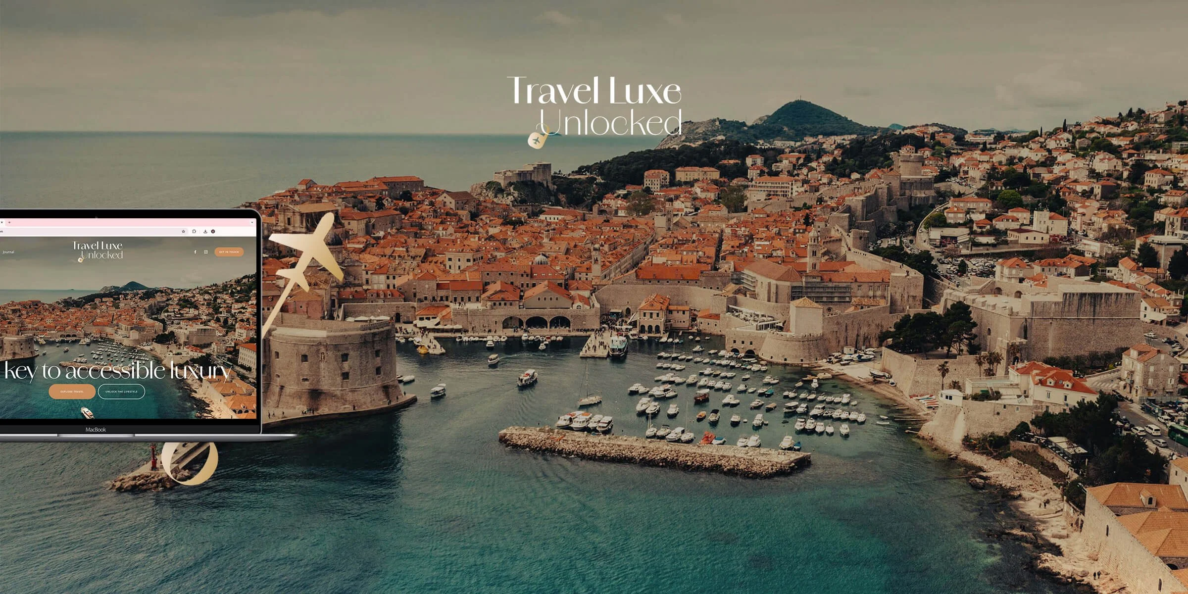
Travel Luxe Unlocked
Branding
〰️
Web Design
〰️
Copy
〰️
Motion Graphics
〰️
Branding 〰️ Web Design 〰️ Copy 〰️ Motion Graphics 〰️
The Brief.
Recommended through word of mouth, the client Sue approached me in need of a designer to take her business to the next level. A few successful months after launching her own independent travel agency, through InteleTravel, Sue recognised the need for a website to professionally market her services and serve as a central point of contact for her expanding client base. Aside from the business name ‘The Travel Luxe’ and a few self-created assets, there was no cohesive brand identity or visual consistency across her marketing channels.
Crucially, the primary objective was to generate more leads and attract new clients. This shaped the brief, calling for an elevated identity that positioned The Travel Luxe as a legitimate, reliable entity, and an easily manageable website that would support Sue’s business objective without impinging on her work and family commitments.
The Identity Process.
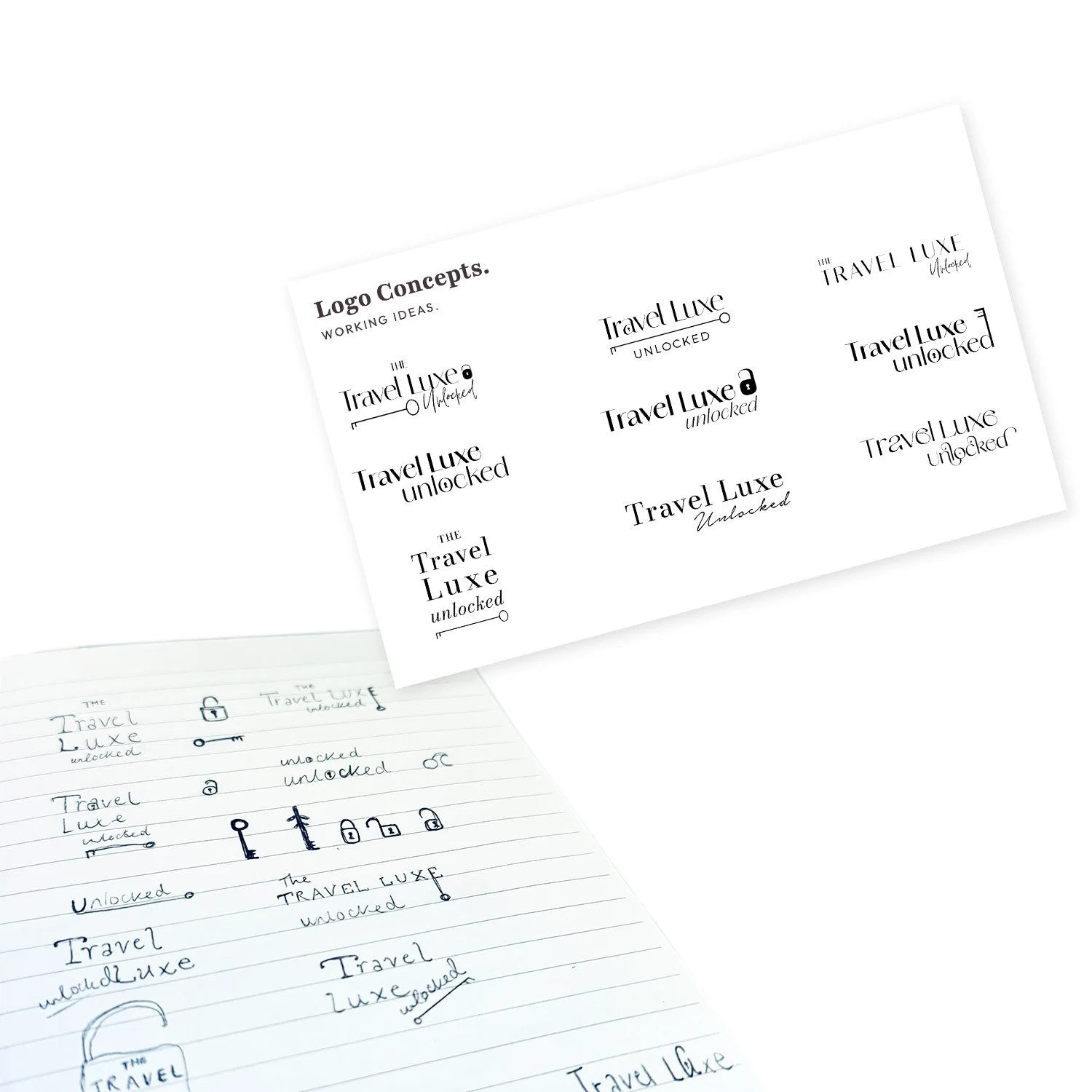
Following a discovery call and initial research, it came to light that The Travel Luxe name faced potential challenges – with existing businesses, domains and trademarks posing SEO competition as well as legal risk. Open to changing the name, Sue wanted to retain the semantics of luxury travel without alienating the everyday consumer or narrowing the demographic.
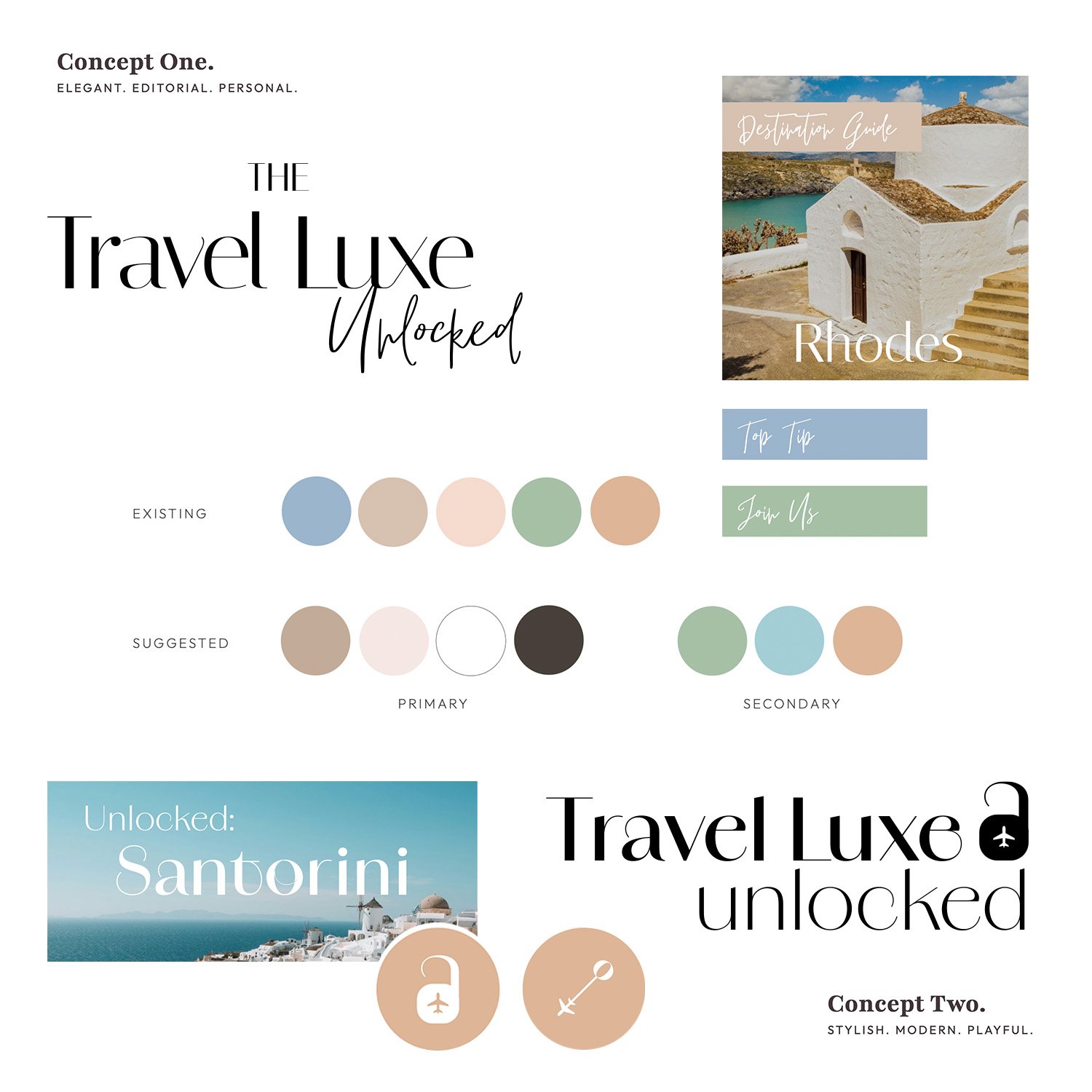
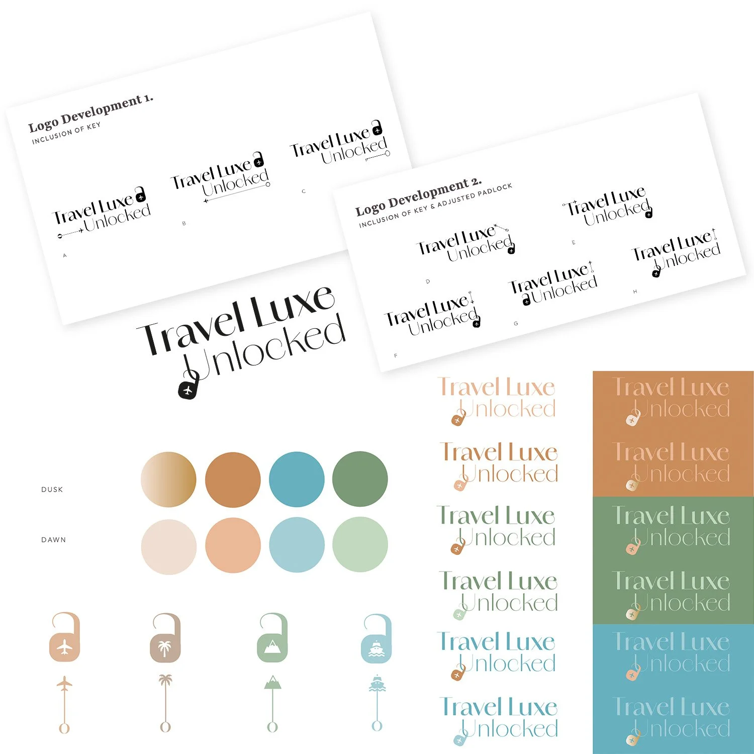
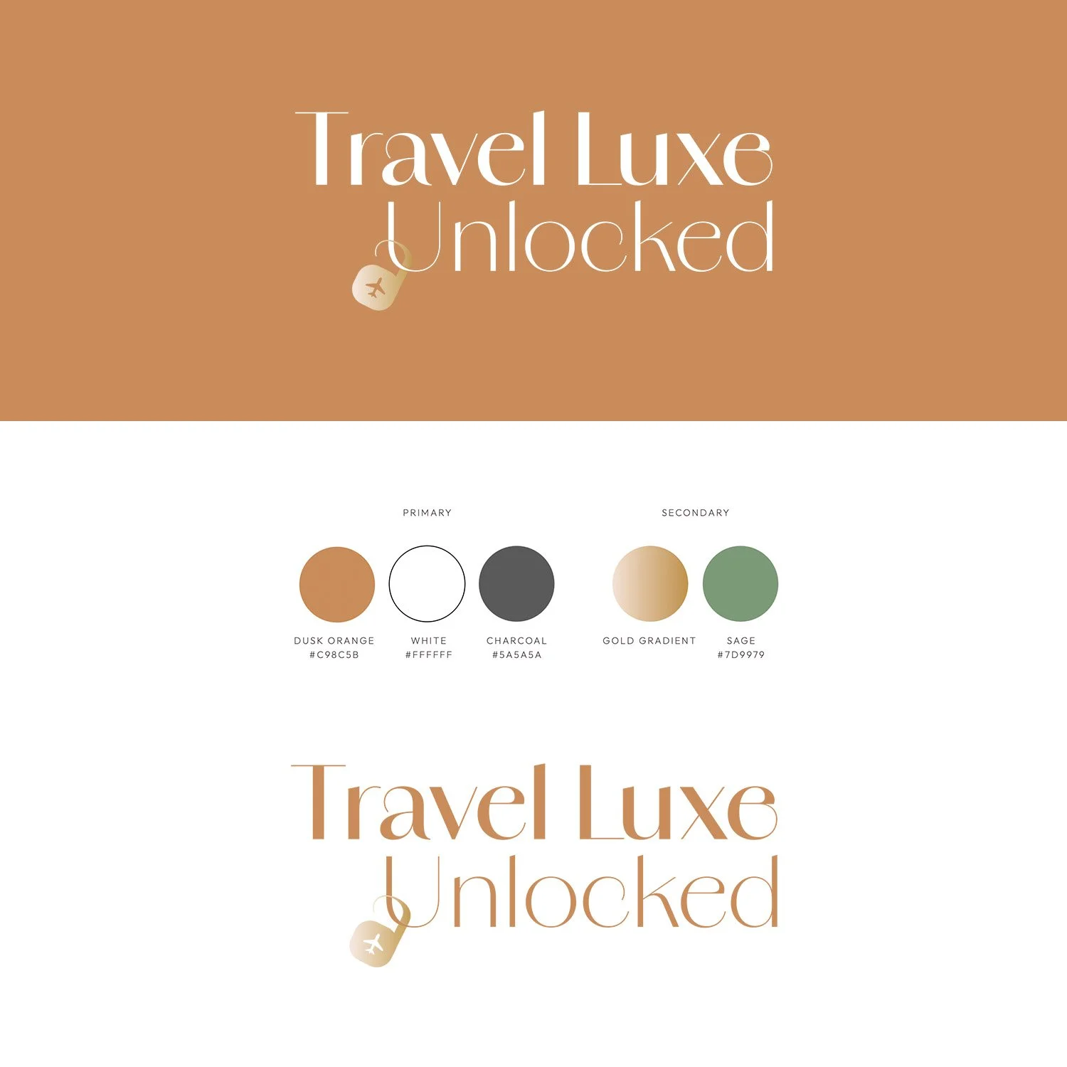
From this, I proposed Travel Luxe Unlocked – a natural evolution that felt modern and exclusive, whilst underpinning the core value of accessible luxury. The visual identity journey then began, with scamps and early mock-ups developed into two distinct design concepts. The first reflected an editorial direction, aligned with the client's preference for elegant serifs and a premium aesthetic. The second playfully crafted iconography, using the terminal and shoulder of the “a” from the typeface, that visually referenced "unlocked" as the brand mark. The second route was taken forward and refined through two development rounds that explored composition of the logo, typographic treatments and ligatures, icon design, and colour palette adjustments.
The Final Brand.
The final iteration of the brand identity evolved in parallel with the website design and build, allowing real-time application of the branding to inform key design refinements.
Most notably, the colour palette was entirely stripped back. From the outset, colour was a strategic focus – intentionally subverting the neutral, monochrome tones deployed by ‘premium’ travel competitors in favour of a warmer, more distinctive injection of character that conveyed accessible luxury. Inspired by the client’s original muted tones, a 'dusk and dawn' colour scale was developed to introduce greater depth and contrast, but testing in context revealed a preference against the lighter pastels and blue hues. The palette was ultimately distilled to the richer dusk shades of orange and green, balancing confidence with simplistic sophistication.
The golden gradient bestows a tinge of luxury upon the logo, with this padlock brand mark becoming central to the brand communication, both visual and written, as demonstrated below.
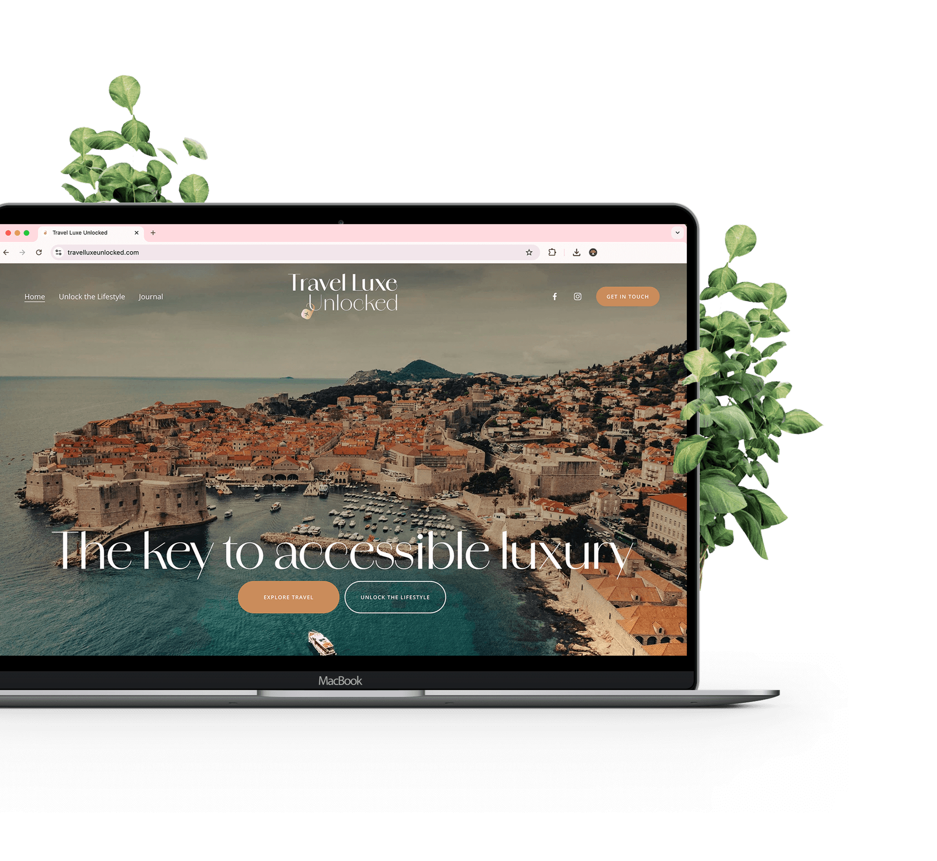
The Website.
Squarespace was chosen for its intuitive CMS, meeting the client's request of a platform she could easily manage and update herself. The website needed to communicate two distinct yet connected propositions – selling bespoke travel services while also promoting the network marketing opportunity to become a travel agent. Balancing both under one cohesive brand was a key challenge, united by a shared goal: to generate new business leads. This drew focus to SEO performance, a clear content strategy, and user experience design that guided visitors toward the primary call to action: making an enquiry.
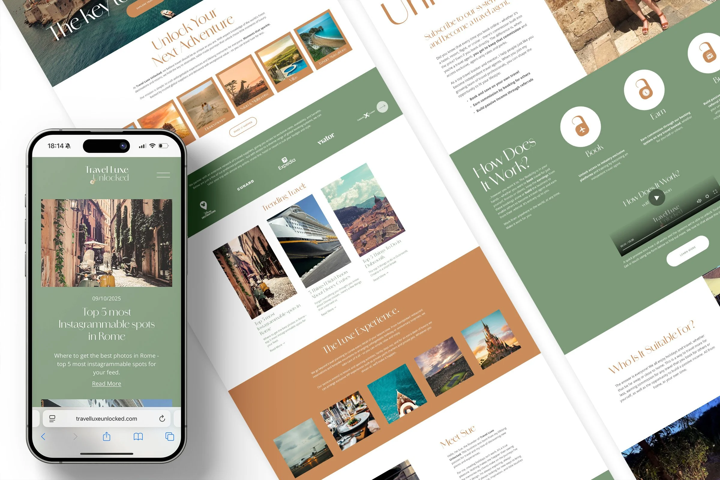
To strengthen organic visibility, a full SEO framework was implemented while the client was trained in best practices to maintain it going forward. Website copy was refined with keyword optimisation, FAQs were introduced to target search queries, and metadata and alt tags were fully implemented. A blog, branded the Journal, was created for the client to share her genuine travel tips and experiences, targeting the SEO content strategy while simultaneously enhancing credibility.
The brand identity influenced the visual and written language deployed across the site. Copy built on the semantic field of “unlocking” accessible luxury and exclusivity, with figurative phrasing like “the key to...” and “Unlock Our Secrets” to entice newsletter sign-up. The padlock emblem reinforced this concept, appearing on the network marketing page to illustrate the benefits users could unlock by joining the business.
The Launch.
To announce the launch of the new brand identity and website, an animated Instagram reel was produced, using Adobe After Effects, to bring the brand to life across social channels. The video showcased snippets of the website and gave a nod to both sides of the business – travel services and recruitment – with clear, cohesive messaging. Supporting assets included new Instagram highlight covers featuring the padlock iconography, updated Facebook cover imagery, and a suite of branded social templates to ensure consistency across all touchpoints.


The Result.
Launched in October 2025, it was exciting to see early success with a cold enquiry received through the website in the first week. It was a pleasure collaborating with Sue and bringing her vision to life. Whilst she is now equipped with the tools, training and confidence to manage the site independently, I very much look forward to working with her again and supporting with the next chapter of CRM as her client base and business continues to grow.
Krystina at Beneath The Toadstool was absolutely wonderful. She took care of branding for my travel business and helped design my logo and brand image. We spent a lot of time discussing how I wanted my website to look and she understood the brief perfectly. The finished website looks amazing and has a really lovely flow to it. I am a complete beginner when it comes to websites but she showed me how to make any amendments or additions after the website went live and is on hand in an emergency, if needed. I am beyond pleased with her services and would not hesitate to recommend her to any business or individual looking for their website development.
“
Sue Wilson
Founder of Travel Luxe Unlocked